The Psychology of Colors in Blogging
 Have you ever wondered why Facebook is Blue? How color of a website affects reader experience? Be it a blog or an e-commerce site, the color of site makes a lot of difference.
This guide is for all those bloggers, entrepreneurs & webmasters who understand that design thinking is the way to progress. You would learn how color affects sales of your site & how readers perceive certain colors.
In a study conducted by Dr. Andrew Elliot at the University of Rochester, simply placing a thick red border around a photo of a person increased how attractive a stranger perceived the person in the photo? According to Psychologists, it’s because humans often flush red when they are attracted or interested in someone. In other words, red is the color of romance.It stimulates us unconsciously.
Color has an enormous psychological influence on human brain and is the most powerful visual cue for drawing immediate attention. Scientists have long found out that color affects the mood, personality and the perception of a brand. Did you know 92% of the people say that visual dimension is the #1 influencing factor affecting their purchasing decision (over taste, smell, etc.)? Or that color increases a brand perception by 80%. For instance, Coca-cola has red as their signature color, as red has been scientifically proven to increase your heartbeat and raise your blood pressure. It instills excitement. Similarly, hp that has blue in its logo. Blue is a cool, clear color which has a feeling of trust and dependability.
Till now, it’s clear that color has a profound effect on us but how can we effectively utilize it to capture other people’s attention. How can we leverage or use it as a tool to market our brand. For that, let’s first understand the basics of color.
The Concept of Colors in web conversion:
Color is broadly divided into three categories: Primary, Secondary, and Tertiary. Primary colors are red, blue and yellow. These can be mixed to create secondary colors that are purple, green, orange. Lastly, there are tertiary colors that are combinations of primary and secondary colors.
There are six tertiary colors; red-orange, yellow-orange, yellow-green, blue-green, blue-violet, and red-violet. For example, tertiary color produced when mixing the primary color blue with the secondary color green is called ‘blue-green.’ You can create different tint (add white), shades (add black) and tones (add White + Black) using the above colors.

Different Cultures drives different color emotions
A single color can have different meanings across different cultures. White may not be a wedding color in India. It is a color of mourning. However, in western cultures, it is a color of celebration and wedding. Similarly, red which is associated with romance, excitement, thrill is a color of death in certain parts of Africa.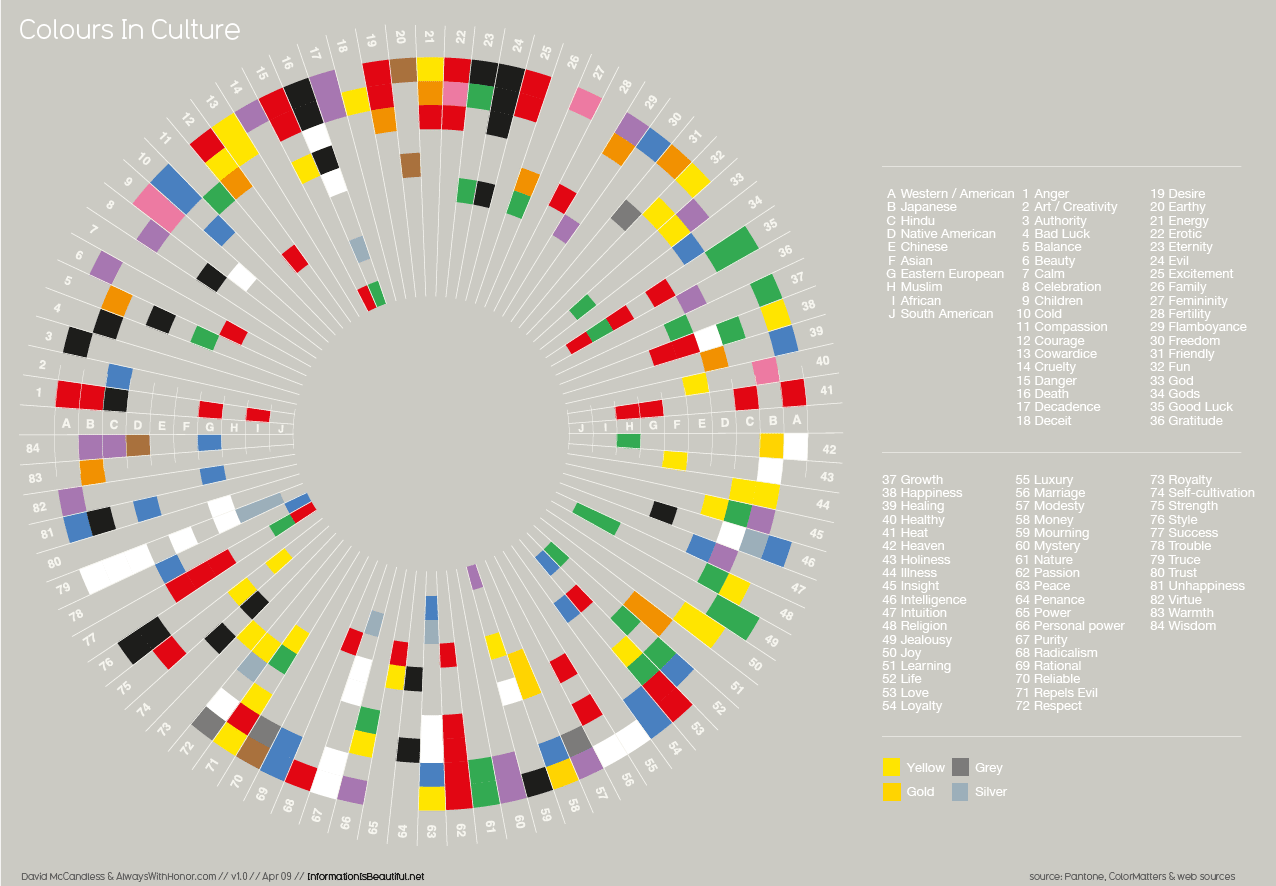
Color influences Men and Women Differently
Depending upon the gender your website is targeting, research has shown that women choose softer colors over brighter color while men choose otherwise. According to a study by Hallock, Blue is favored by both Men (57%) and Women(35%) than rest of the colors. Here is the detailed analysis of the same: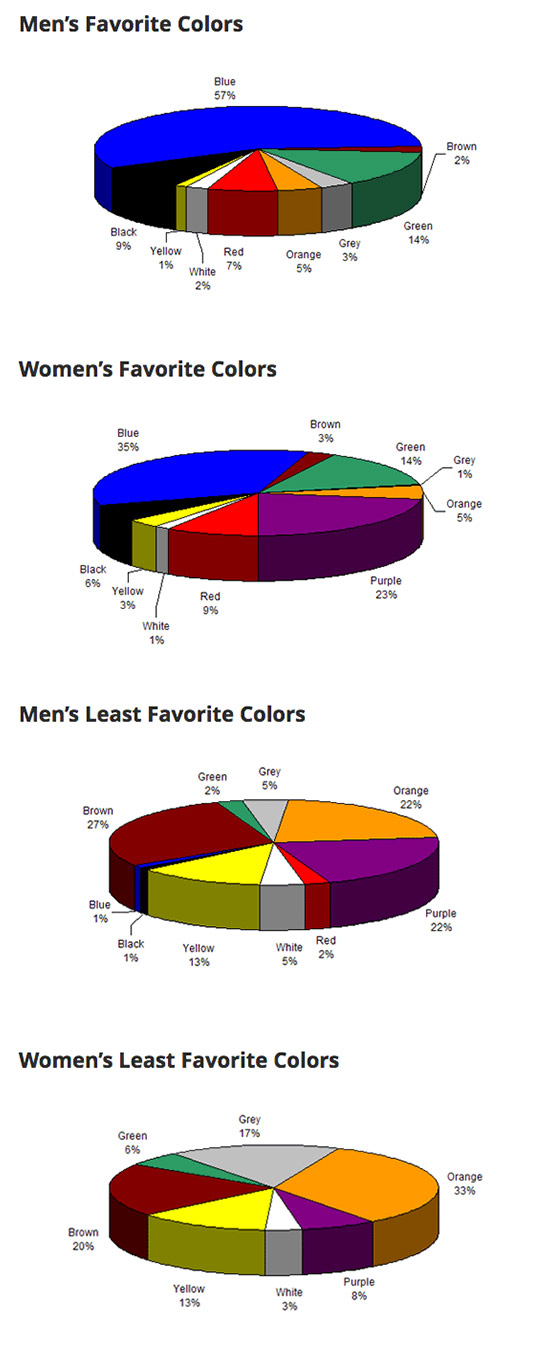
 Given how the taste of men and women is different, you should choose the color carefully by understanding that gender makes the greater percentage of your target audience or customer. If your audience is men, try using green or shades of green.
Color Impacts Emotions and Behaviors
Color can make us feel happy or sad. It can make us feel hungry or relaxed. As a brand, it’s crucial for you know the psychological effect color has on an individual or your Client. Let’s take a closer look on how color drives emotions and behaviors.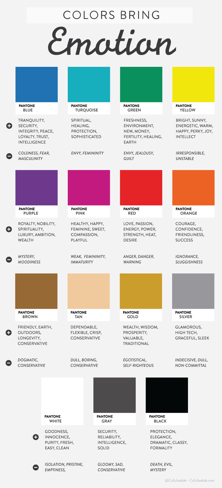
Note: Orange and Yellow buttons should be on contrast background; if it would have been on any other background say red, it will create the same result. This is because color contrast is how our brain finds and attend to relevant stimuli.
How Color Contrast Increases the Conversion?
To check how color contrast works, let’s look at YouMash Home Page at different sizes.Did you notice that the gray Call to Action button still stands out? This is the effect of contrast, makes the most significant actions pop out increasing the conversion rates. Studies suggest that people make a subconscious judgment about a product within 90 seconds of initial viewing. Up to 90% of that assessment is based on color alone.
I think now you know, what you need to do if you want to capture the attention of your customers by utilizing colors. If you want people to notice you at the bar, wear bright colors which contrast with the dark background of bars. If you want to people to buy your stuff, choose a color that is opposite of your website’s background.
There are different online tools to measure color contrasts. WebAIM is a color contrast checker tool for checking the ratios of two different colors and whether they are according to Web content accessibility guidelines. You can also use the following formula suggested by theWorld Wide Web Consortium (W3C) to determine the difference between two colors.
(maximum (Red value 1, Red value 2) - minimum (Red value 1, Red value 2)) + (maximum (Green value 1, Green value 2) - minimum (Green value 1, Green value 2)) + (maximum (Blue value 1, Blue value 2) - minimum (Blue value 1, Blue value 2)) The difference between the background color and the foreground color should be greater than 500.Case Studies which shows how color affects conversions
1. CareLogger:
A health app that allows you to keep track of your diabetes. They had a green Call to Action (CTA) button that they wanted to test with a new red one. After 600 signups with the exact same CTA and just a different button color, the red button saw 34% more conversions than the green.
Similarly, Unbounce changed a dark blue “Add to Cart” button on a gray background to bright green. It improved its conversions by 35.81%.
2. UK Airline BMI:
It had an urgent CTA that read “Hurry! Only XX seats left.” When they added a red background to the CTA, they increased their conversions 2.5%. Thus, Colors that coordinate with the message may increase conversions. Consistency among text and colors can help reinforce the message you want to instill in visitors.3. Performable:
Performable wanted to learn how changing the call-to-action button color would affect the site’s overall conversions. Changing the CTA button color from green to red Performable was able to increase its click-through rate by 21%
4. Heinz:
Heinz changed their signature ketchup color from red to green. Result: More than 10 million bottles were sold in the first seven months following its introduction,$23 million in sales [the highest sales increase in the brand’s history]. All because of a simple color change.
Conclusion:
There is no sure shot solution or one right color that will work across all platforms. So, the question is how do you pick the right color? Here is my suggestion:- Study the market you want to attract based on age, gender, culture and the color language they will respond best to.
- Do thoughtful A/B testing to determine which color combinations and positions will work best for you to generate maximum leads and conversions.
- Apply it on your website and keep reinventing and experimenting with colors and color contrast, brightness and saturation.


No comments:
You are welcome to share your ideas with us in comments!